A lot of listings have the same problem right now. The rooms are clean, neutral, professionally shot, and instantly forgettable. Buyers scroll past them because nothing creates a visual hook. Hosts run into the same issue with short-term rentals. The property is fine, but the photos don’t give anyone a reason to remember it.
That’s where pink and black room decor earns its place.
It’s not a universal palette, and that’s exactly why it works. In the 2024 North American home décor market, pink ranked among the least favored colors, with 34% of homeowners calling it the most unappealing option, while clean minimal designs were favored by 59% of respondents according to this home décor market roundup. For broad appeal, that sounds like a warning. For marketing, it’s useful. Distinctive palettes help a listing target a specific buyer or guest instead of blending into a sea of beige.
Pink and black also fit how many design-led rooms are being styled for mood. Soft pink takes the edge off black. Black gives pink structure. Used well, the pair feels polished, editorial, and intentional. Used badly, it looks juvenile or heavy.
The smart move is to test it before anyone opens a paint can. Virtual staging tools like BrightShot make that practical. You can stage one room in a softer blush-and-black look, test another with a darker boutique-hotel mood, correct the lighting, and compare which version makes the property feel more valuable on screen. That’s the primary opportunity. You’re not decorating for decoration’s sake. You’re building listing images people stop to study.
1. Modern Minimalist Pink and Black Accent Wall
A single accent wall is still the safest entry point for pink and black room decor, especially in listings where you want impact without turning the whole room into a style statement.

Black or charcoal behind the bed works best when the other walls stay light gray, soft white, or warm off-white. Then layer in pink through geometry instead of broad coverage. Think a blush block, a slim arch, or restrained line work rather than a full mural. That keeps the room contemporary and easier to market.
Why this works in listings
Dark feature walls photograph well when they anchor the room and sit in the first camera angle from the doorway. They create depth, which helps standard bedrooms feel more intentional. I see this work especially well in urban condos, compact primary bedrooms, and boutique Airbnb-style spaces where every photo needs a focal point.
Furniture needs restraint. Keep the bed neutral. Use black bedside tables or slim black lamps, then add one or two pink elements such as cushions or artwork. Metallic gold or brushed silver is useful here because it breaks up the contrast and stops the room from looking flat.
Practical rule: If the wall is bold, the furniture should calm the room down.
What to test before committing
The biggest risk is poor lighting. Black walls absorb light, and amateur photos make them look muddy. That’s why I’d test the concept digitally first with BrightShot’s accent wall workflow. It lets agents see whether the wall adds polish or just makes the room feel smaller.
A few specifics matter:
- Choose the right wall: Pick the wall visible from the entry or the main photo angle.
- Keep shapes disciplined: Geometric pink details should feel architectural, not crafty.
- Limit accessories: One metallic finish is enough. Mixing brass, chrome, and rose gold usually weakens the edit.
This style doesn’t try to please everyone. It gives a clean room a sharper identity, and that’s often the better sales move.
2. Glamorous Art Deco Pink, Black, and Gold Styling
A buyer opens the listing for a luxury condo and scrolls past five neutral bedrooms in a row. Then one room appears with blush upholstery, black case goods, and restrained gold detailing. That image gets remembered.
Art Deco styling works best in properties that are already selling aspiration. Penthouses, polished condos, hospitality-style rentals, and historic renovations can carry this look because the palette supports a premium story. The goal is controlled glamour, not costume.
Start with blush or dusty pink instead of a sugary pink. Bring in jet black through a bed frame, lacquered side tables, window frames, or a dramatic headboard. Add gold sparingly through sconces, mirror frames, cabinet pulls, or a chandelier. Materials do a lot of the selling here. Velvet, marble-look surfaces, smoked glass, fluting, and glossy finishes all read well on camera when the room still has negative space.
Why this style helps a listing stand out
This approach gives buyers a clear point of view. In listing galleries full of safe staging, that matters. A well-edited Deco room suggests design confidence, which often helps luxury listings feel more complete and more expensive.
The rug often carries the composition, especially in virtual staging. A geometric pattern in pink, black, and gold can pull the room together fast, define the bed zone, and make the first photo feel finished. I use that as a test point early because if the rug looks forced, the whole concept usually needs to be scaled back.
For agents using AI staging, this is a strong style to trial before spending on physical installs. BrightShot can help you test whether the room should read boutique hotel, upscale rental, or classic Deco glamour, then generate photo-ready variations for the listing set. If the architecture includes strong trim, doors, or casings, it also helps to study trim color ideas that sharpen contrast in photographed interiors so the black detailing supports the styling instead of competing with it.
What keeps it elegant
Art Deco falls apart when every item asks for attention. One statement light fixture, one strong rug, and one standout upholstered piece are usually enough.
Use a few guardrails:
- Build around symmetry: Paired lamps, centered art, and balanced nightstands make the room feel expensive.
- Keep gold in one family: Mixed brass, polished gold, and rose gold in the same shot usually look messy.
- Leave visual rest: Blank wall space and simpler bedding keep the room from tipping into set design.
- Match the architecture: Curved mirrors and Deco geometry suit arched openings, taller ceilings, and formal layouts better than basic box rooms.
There is a trade-off. This palette narrows the audience slightly, but in the right property it gives the listing a stronger identity, and that is often the better sales decision.
3. Feminine Blush Pink with Deep Black Trim and Molding
This look works because the pink isn’t doing all the talking. The trim is.
Soft blush or dusty mauve walls can read sweet on their own. Add black trim, crown molding, baseboards, or a black door frame, and the room suddenly looks structured. The color pairing feels more architectural and less decorative. That distinction matters in listing photos.
Why trim changes the whole room
Most agents focus on walls and furniture first. Buyers often react more strongly to the edges of a room. Trim gives the eye a framework. Black trim outlines the space, sharpens the photographs, and gives even a simple bedroom or bathroom more presence.
This is one of the strongest pink and black room decor approaches for newer homes that need character or for secondary bedrooms that would otherwise disappear into the listing gallery. It also suits upscale nurseries, powder rooms, and compact guest rooms where full dark walls would feel too heavy.
Use matte on the walls and a slight sheen on the trim if the finish is physical. In a virtual staging workflow, pay attention to line accuracy. Crooked trim reads instantly in photos and undermines the whole effect.
Black trim only looks luxurious when it looks precise.
Where agents get this wrong
The usual mistake is pairing blush walls with too many soft accessories. Then the room drifts into a one-note look. The black trim should be supported by a few other black elements. A mirror frame, a lamp base, a chair leg, or hardware is enough.
Brass helps this scheme because it warms both colors without competing. White curtains can soften the contrast if the room gets limited natural light.
If you’re testing the idea in a white room first, these trim color examples from BrightShot are useful for seeing how dark outlining changes perception before a client commits.
This approach is refined, but it isn’t neutral. It attracts buyers who want a room with identity while still preserving enough restraint to keep the photos broadly usable.
4. Contemporary Geometric Pattern Mix in Pink and Black
Patterns sell personality fast, but they also go wrong fast. In pink and black room decor, geometry is the safest pattern language because it feels intentional on camera.

Chevron, grids, arches, hexagons, and abstract linework all work. Floral patterns are harder to control in listing imagery. Geometry feels cleaner and usually appeals better to younger buyers and renters looking for a room with some edge.
How to keep it sharp
Use only two or three geometric expressions in one room. For example, a wallpaper with angular lines, a rug with a smaller repeat, and plain cushions in solid black or dusty pink. If you add a fourth pattern, the room often starts to feel busy.
Removable applications are especially useful here. Search interest for renter-friendly pink and black wallpaper rose sharply in 2025 and 2026 according to this summary of rental-friendly décor demand. That tells me there’s strong practical interest in testing the look without making permanent changes. For rental listings, multifamily units, and host-managed spaces, that flexibility matters.
A product such as Geometric Rose Gold Black Vinyl Sticker shows the direction well. It gives you pattern without the cost or risk of a full wall treatment.
Best use cases
This look tends to perform best in:
- Home offices: Younger buyers often respond well to a room that feels designed, not generic.
- Guest bedrooms: Pattern gives these rooms a role in the listing instead of making them feel like leftover square footage.
- Urban rentals: A visual hook can help a listing stand out when the floor plan itself isn’t special.
Here’s a useful visual reference for how pattern-led rooms can be styled on screen:
The trade-off is simple. Pattern adds memorability, but only when the furniture and styling stay quiet enough to support it.
5. Moody Maximalist with Rich Pink and Black Textures
Some rooms need discipline. Others need atmosphere. Moody maximalism works when you’re marketing to buyers or guests who want the listing to feel like an experience.
This version of pink and black room decor uses saturated pink, deeper blacks, layered bedding, heavier drapery, mixed finishes, and visible texture. Velvet, boucle, leather, dark-stained wood, smoked glass, and oversized art all help. It’s not clutter. It’s density with control.
The right property for this look
I’d reserve this for lofts, creative studios, boutique hospitality properties, and higher-end short-term rentals. It can also work in a media room, a dramatic bedroom, or a statement home office where personality is part of the property’s appeal.
Future-facing trend coverage around 2026 has highlighted “dusty rose meets dramatic black accents” as a styling direction, with The Coolist summary also describing technical guidance like blush pink around LRV 40 to 50 and black finishes around LRV 0 to 5 for balanced render depth. That’s useful in staging because moody rooms don’t just need color. They need light control so the detail doesn’t disappear.
What works and what doesn’t
The mistake is treating maximalism like a license to fill every corner. You still need one dominant focal point. Usually that’s the bed wall, a black fireplace, or an oversized art grouping.
Use a simple hierarchy:
- Pick one hero surface: Black wall, bold wallpaper, or statement headboard.
- Layer texture before adding more color: Texture gives richness without making the room chaotic.
- Hold back one zone: Leave a clean nightstand, plain section of wall, or uncluttered floor area.
More objects won’t make the room feel more expensive. Better layering will.
If you want a quick mockup before styling in person, BrightShot’s moody interior design guide is a practical reference point. It’s especially helpful when the original room is blank and you need to judge whether a darker mood adds value or just narrows appeal too much.
This look is bold. That’s the point. It gives the right listing a clear identity and attracts the buyer who wants memorable over safe.
6. Sophisticated Monochromatic Shades of Pink and Black
Not every pink-and-black room needs obvious contrast. Some of the strongest rooms use a tonal gradient instead.
Think black, charcoal, warm gray, mauve, blush, and pale pink layered from the largest surfaces down to the smallest accessories. That creates a softer, more expensive look than bright pink against hard black. It’s one of the most adaptable forms of pink and black room decor because it feels cohesive rather than confrontational.
Why tonal schemes stage well
A tonal room gives the camera subtle variation. Walls, bedding, throws, upholstery, and art all support one another. In person, that feels calm. In listing photos, it reads curated.
This is especially effective in luxury condos, spa-style bedrooms, dressing rooms, and executive home offices. Buyers who might reject a louder pink room often respond better to gradients because the palette feels intentional and mature.
One overlooked advantage is how well monochromatic styling pairs with black-and-white artwork. Pieces in that direction, like the examples discussed in this article on art in black and white, can stabilize a room that already uses multiple pink values.
Where the balance usually breaks
The common problem is that everything ends up too soft. Then the room loses shape. You still need a few points of definition. A black frame, a charcoal bed base, dark lamp stems, or one sharply outlined bench can do that job.
Keep these principles in play:
- Use texture to separate tones: Velvet, linen, matte paint, boucle, and metal prevent sameness.
- Test pink in both day and evening light: Some blush shades turn beige. Others turn purple.
- Save the darkest value for structure: Bed frame, trim detail, artwork frame, or lighting.
This look won’t create the same immediate jolt as a geometric wall or moody maximalist setup. It does something else better. It gives the property sophistication without asking the buyer to work hard to understand it.
7. Playful Contemporary with Millennial Pink and Black Accents
This is the version most agents can use without scaring a seller.
Millennial pink, especially dusty or mauve-based pink, works best as the dominant color. Black stays in the supporting role through frames, hardware, side tables, pendant lights, planters, or slim furniture legs. The result is lighter, fresher, and more approachable than the heavier versions of pink and black room decor.
Why this can perform well online
In real estate and short-term rentals, softer pink backgrounds with controlled black details often read well on phones. They feel styled but not intense. That matters because many buyers and guests make a snap judgment from a small screen first.
There’s also a practical reason to test this palette in rentals and hospitality. A summary of underserved short-term rental staging angles notes that color-contrasted rooms, including bold pairings like pink and black, correlated with higher occupancy in urban markets according to this pink-and-black staging gap analysis. That doesn’t mean every host should repaint tomorrow. It does mean strong contrast is worth testing when a listing feels flat.
How to keep it current
Skip hot pink. It dates fast and often photographs aggressively. Dusty rose, muted blush, and mauve-based pinks are easier to market. Then use black in small, crisp doses.
Good pairings include:
- Black picture frames with blush walls
- Cream bedding with a black reading lamp
- Mauve upholstery with black hardware
- Pink curtains with a slim black curtain rod
A few plants help because greenery softens the palette and prevents the room from feeling too styled for social media and not enough for real life.
This look is especially strong in secondary bedrooms, creative home offices, and furnished apartments aimed at younger professionals. It doesn’t try to feel grand. It feels current, easy, and photogenic.
8. Industrial Chic in Pink and Black Urban Spaces
Industrial spaces often have one problem in photos. They look cold. Pink solves that faster than almost any other accent color.
A loft with exposed brick, black-framed windows, concrete floors, ductwork, and steel lighting already gives you the black side of the equation. Add pink through textiles, art, an upholstered headboard, a rug, or a lounge chair, and the room becomes more livable without losing its edge.
Where this style earns its keep
Warehouse conversions, artist lofts, adaptive reuse buildings, and urban rentals are the natural fit. In those spaces, you don’t want to cover the architecture. You want to frame it. Pink should soften the room, not compete with the brick, beams, or concrete.
This is one of the easiest pink and black room decor directions to stage virtually because the property already has visual character. You’re not inventing the room. You’re amplifying what’s there.
Use black metal and reclaimed wood as anchors. Keep walls neutral unless there’s a feature wall that clearly benefits from darker treatment. Then bring in pink through layers that can be swapped or digitally tested.
The details that matter most
Lighting is critical in industrial rooms. Hard finishes can make photos feel flat if the shadows get too dense. BrightShot’s virtual staging tools are useful here because they can preserve the architectural grit while cleaning up the image and refining the furniture mix. For styling cues, BrightShot’s industrial interior design guide is a strong starting point.
In lofts, the architecture should stay in the lead. The decor should support it.
A few practical moves keep the space marketable:
- Use pink low in the room: Rugs, bedding, and seating usually look better than large pink wall coverage.
- Repeat black intentionally: Window frames, lighting, and furniture should relate to one another.
- Add one soft element: Curtains, a textured throw, or an upholstered bench keeps the room from feeling severe.
Industrial pink and black works because it adds warmth without sanding off the property’s identity.
Pink & Black Room Decor: 8-Style Comparison
| Style | Implementation Complexity 🔄 | Resource Requirements ⚡ | Expected Outcomes ⭐📊 | Ideal Use Cases 💡 | Key Advantages ⭐ |
|---|---|---|---|---|---|
| Modern Minimalist Pink and Black Accent Wall | Low–Medium 🔄, simple paint/virtual staging | Low ⚡, paint or AI staging, pro photos recommended | High ⭐📊, strong visual impact; increases listing clicks | Contemporary apartments, small spaces, social-led listings 💡 | Photographs well; easy to test virtually ⭐ |
| Glamorous Art Deco Pink, Black, and Gold Styling | High 🔄, careful patterning & symmetry required | High ⚡, quality fixtures, fabrics, lighting, staging | Very High ⭐📊, conveys luxury; supports premium pricing | Luxury penthouses, boutique hotels, high-end listings 💡 | Distinctive luxury appeal; justifies premium rates ⭐ |
| Feminine Blush Pink with Deep Black Trim and Molding | Medium 🔄, precise trim work needed | Medium ⚡, quality paint, skilled applicator, trim materials | High ⭐📊, adds perceived architectural value | Bedrooms, bathrooms, traditional or modern homes 💡 | Sophisticated, broadly appealing; photographs warmly ⭐ |
| Contemporary Geometric Pattern Mix: Pink and Black | Medium–High 🔄, pattern coordination and installation | Medium ⚡, wallpapers, decals, professional hanging | High ⭐📊, memorable, social-media friendly | Millennial-targeted rentals, creative spaces, Airbnbs 💡 | Highly shareable & changeable (removable wallpaper) ⭐ |
| Moody Maximalist: Bold Pink and Black with Rich Textures | High 🔄, complex layering and curation | High ⚡, furniture, art, textiles, professional styling | High ⭐📊, dramatic imagery; strong emotional engagement | Artist lofts, creative studios, boutique hospitality 💡 | Very distinctive storytelling; strong social engagement ⭐ |
| Sophisticated Monochromatic: Gradients of Pink and Black | Medium 🔄, careful tonal selection and coordination | Medium ⚡, multiple finishes, textures, calibrated lighting | High ⭐📊, polished, cohesive look; appeals upscale buyers | Luxury condos, executive suites, spa-like listings 💡 | Cohesive, timeless elegance; easier to scale across rooms ⭐ |
| Playful Contemporary: Millennial Pink with Black Accents | Low–Medium 🔄, straightforward paint + accents | Low ⚡, paint, accessories, lighting quality | High ⭐📊, Instagram-friendly; strong appeal to younger buyers | Millennial rentals, short-term stays, secondary bedrooms 💡 | Trendy, approachable; quick to implement and photograph ⭐ |
| Industrial Chic: Black and Pink in Loft and Urban Spaces | Medium–High 🔄, requires integration with architecture | Medium ⚡, highlight existing features, targeted soft furnishings | High ⭐📊, authentic character; strong urban appeal | Lofts, warehouse conversions, urban investment properties 💡 | Leverages original architecture; balances warmth and edge ⭐ |
From Concept to Listing Your Action Plan
A listing goes live on Thursday. By Friday afternoon, buyers have clicked past ten neutral bedrooms that look almost identical. The room that gets saved is usually the one with a point of view.
Pink and black room decor works best as a listing strategy when it gives a forgettable space a clear identity. Real estate agents do not need every buyer to love the look. They need the right buyer to remember the property, click through the gallery, and book a showing.
That is why I test bold palettes before anyone buys paint.
Buyer pools for many homes still favor safe interiors. Generic listings disappear into that sameness, especially online, where the first photo has one job. Get attention without making the room feel unusable. Pink and black can do that when the balance is controlled and the style fits the property. A downtown condo can carry sharper contrast. A suburban primary bedroom usually needs a quieter version with softer pink and less visual weight from black.
Start with one underperforming room and build three directions from the same photo. Use a minimalist version with a black accent wall and pale blush bedding. Build a second option with Art Deco symmetry, brass accents, and stronger contrast. Create a third version for an industrial property that uses the original architecture and keeps pink mostly in textiles and art. Then compare the images the way buyers will. Which one reads clearly in thumbnail size? Which one supports the price point? Which one feels memorable without narrowing the audience too far?
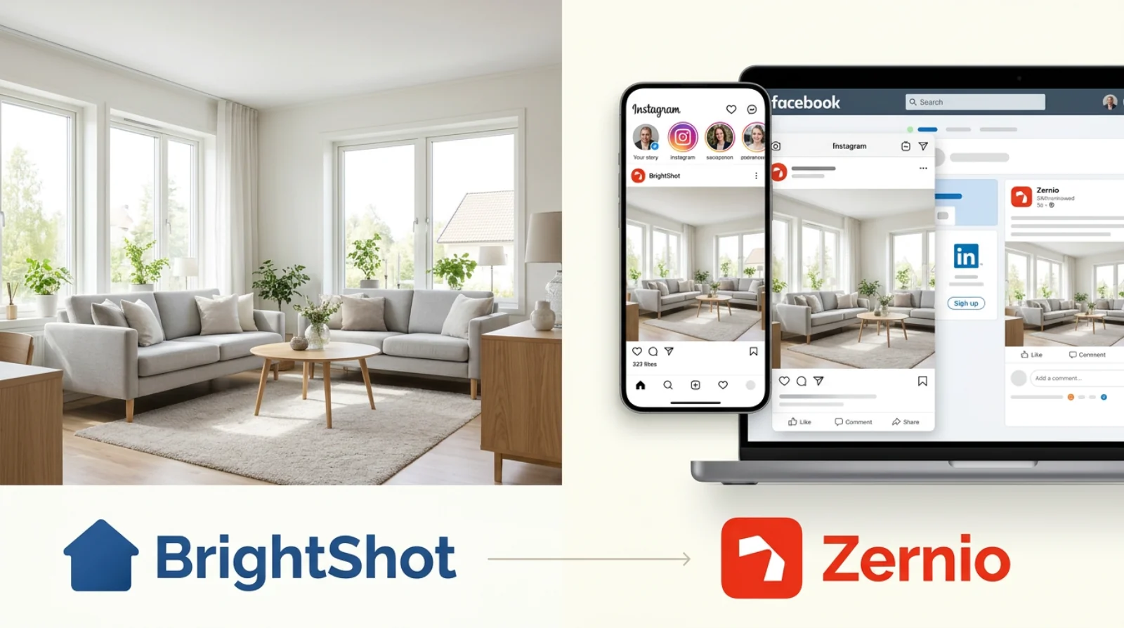
BrightShot helps teams run that test quickly. Agents and marketers can virtually stage an empty room, adjust dark-wall exposure, remove clutter, refine angles, and produce polished listing visuals before committing to a physical install. That speed matters when a property needs to hit the market fast or when a seller is unsure how far to push the design.
Restraint still sells.
Pink should introduce warmth, softness, or personality. Black should define the room, frame key features, and add contrast on camera. Keep one focal point. Leave enough quiet space for buyers to project their own life into the room. If every surface competes, the design feels editorial but not livable, and that hurts conversion from click to showing.
Use the property itself as the guide. A high-rise rental can support a cleaner, bolder concept. A period home often performs better with blush walls, black trim, and details that build on the original architecture. A flex room or spare bedroom is usually the safest place to test a stronger look because it adds visual interest without forcing the palette across the whole home.
If one pink-and-black concept makes the room more marketable in photos, carry that logic into the listing package. Match the staging style to the buyer profile, keep the execution tight, and let the images do their job.
If you want to turn bold design ideas into listing-ready visuals without the cost and delay of physical staging, try BrightShot. It lets you test pink and black room decor styles, enhance lighting, stage empty rooms, and create polished images and video walkthroughs in seconds so your listings stand out for the right reasons.