Tired of the same old beige and stark white? There’s a reason designers and savvy real estate pros are turning to blue-grey. It’s more than just a color; it’s a mood. This sophisticated shade mixes the calming, trustworthy vibe of blue with the chic, modern feel of grey, creating spaces that feel both elegant and serene.
It strikes a perfect balance—making rooms feel larger, more luxurious, and instantly welcoming.
Why Blue Grey Is the New Must-Have Neutral

Let’s be honest, the era of all-beige-everything is over. For those of us staging and selling homes in 2026, blue-grey has become a secret weapon. It’s not just another passing fad; it’s a smart, strategic choice that blends beautiful aesthetics with a bit of psychology to create spaces that truly connect with buyers.
Today’s homebuyers are looking for personality. They want a space that feels thoughtful and curated, not generic. Blue-grey delivers exactly that, providing a sense of sophisticated calm that immediately elevates a property from a simple house to a potential home.
The Psychology Behind Its Appeal
The real magic of blue-grey is how it makes people feel. If you’re not already familiar with the basics of color psychology in interior design, it’s worth a read. It explains exactly why certain shades can make a room feel more inviting or even increase its perceived value.
Here’s what blue-grey brings to the table for a property listing:
- A Sense of Calm: The blue in the mix is known to be soothing. It helps lower stress, making buyers feel relaxed and comfortable the moment they walk through the door.
- An Air of Sophistication: Grey adds that touch of elegance and maturity. It subtly signals quality and refinement, making the entire space feel more upscale.
- The Illusion of Space: Lighter blue-greys are fantastic for making rooms feel brighter and more open—a huge selling point, especially in smaller homes or condos.
This isn’t just theory. Recent market analysis shows a significant trend toward these richer neutrals. In some studies, homes staged with textured, blue-grey monochrome palettes saw their perceived luxury value jump by as much as 18%.
What the Industry Trends Are Saying
The design world is fully on board. Data from the 2026 High Point Market revealed a huge surge in blue-grey interiors. We saw blue-green shades, like Benjamin Moore’s popular HC-143 Wythe Blue, featured in a whopping 45% of showroom vignettes.
That’s a 30% jump from the previous year, underscoring a clear shift away from the bland, one-note neutrals that used to be the default.
To help you get started, here’s a quick look at some of the most popular blue-grey paint colors that are defining the trend for 2026. These shades are tried and true favorites among designers for their versatility and impact.
Popular Blue Grey Paint Shades for 2026
| Paint Name (Brand) | Undertone | Best For | Pairs Well With |
|---|---|---|---|
| Krypton (Sherwin-Williams) | Cool, Crisp Blue | Bathrooms, bedrooms, home offices | Bright white trim, silver fixtures |
| Smoke (Benjamin Moore) | Soft, Muted Green | Living rooms, kitchens | Warm woods, brass accents, cream |
| De Nimes (Farrow & Ball) | Deep, Inky Grey | Accent walls, dining rooms, cabinetry | Leather, rich textiles, marble |
| Watery (Sherwin-Williams) | Light, Airy Aqua | Sunrooms, coastal-themed spaces | Light wood tones, natural fibers |
Choosing the right shade from a trusted brand can make all the difference. This shift proves that incorporating blue-grey isn’t just a matter of taste—it’s a smart, market-driven decision that aligns with what today’s buyers are looking for. And with modern tools, applying this high-impact color to a listing to boost its appeal has never been easier.
Choosing the Right Blue Grey for Any Room

The world of blue-grey paint can feel endless, but finding the perfect shade really comes down to understanding its two distinct personalities: cool and warm. Not all blue-greys are the same, and their subtle undertones are what truly define the atmosphere of a room.
Cooler blue-greys have a crisp, airy quality, leaning more toward true blue or even a touch of violet. Think of a misty morning or a sharp winter sky. These are fantastic for making smaller spaces feel larger and more open.
Then you have the warmer blue-greys. These shades are infused with hints of green or even yellow, giving them a more grounded, earthy feel. A color like Farrow & Ball’s ‘De Nimes’ is a perfect example—it feels cozy and inviting, creating a space you want to settle into.
Decode the Room’s Natural Light
If there’s one piece of advice I can give, it’s this: the most critical factor in your choice is the room’s natural light. The direction a room faces will completely change how a color looks on the walls.
-
North-Facing Rooms: These rooms have cool, indirect light throughout the day. A steely, cool blue-grey can quickly feel cold and uninviting here. To avoid this, choose a blue-grey with a noticeable green or beige undertone to balance out the chill. Benjamin Moore’s ‘Gray Owl’ is a classic that works wonders in these conditions.
-
South-Facing Rooms: Ah, the dream scenario. These rooms are flooded with warm, bright light, giving you a ton of flexibility. A cooler blue-grey will be beautifully balanced by the golden sunlight, while a warmer one will feel even more rich and enveloping.
-
East & West-Facing Rooms: Here, the light is a moving target. East-facing rooms get bright morning light but cool down in the afternoon. West-facing rooms are the opposite. The trick is to test your paint samples on opposite walls and watch them throughout the day to find a shade that looks great in both warm and cool light.
The biggest mistake I see people make is choosing a color under the harsh fluorescent lights of a hardware store. Please, always test samples in the actual room. Paint large swatches on at least two different walls and see how the color shifts from morning to night.
Match the Shade to the Mood
Once you’ve considered the light, think about the room’s purpose. What kind of feeling are you trying to create? Are you aiming for a serene retreat or a dramatic, formal space?
For a bedroom or bathroom where you want to unwind, a lighter, softer blue-grey like Sherwin-Williams’ ‘Krypton’ can evoke a calm, spa-like atmosphere. On the other hand, in a dining room or study, a deeper, moodier shade can add a layer of sophistication and intimacy, encouraging conversation and focus.
We’ve seen this shift in the market firsthand. In the early 2010s, cool, sterile greys were everywhere—some estimates showed they covered over 60% of new residential listings. But by 2022, buyers started craving warmth, and sales of those stark greys dropped. The new wave of blue-grey, like Valspar’s ‘Encore,’ is warmer and more complex, a trend we see continuing into 2026.
After you’ve analyzed your light and decided on a mood, you can start building out the rest of your palette. If you need a quick way to see how your chosen blue-grey will play with other colors and textures, a color palette generator can be a great tool for experimenting before you commit.
Applying Blue-Grey Design Room by Room
Alright, let’s get to the fun part—bringing this all to life inside the home. Applying a blue-grey color scheme isn’t about slapping the same paint on every wall. The real magic happens when you tailor the color to each room’s unique purpose and mood, creating a space that buyers can truly connect with.
Here’s my room-by-room playbook for getting it just right.
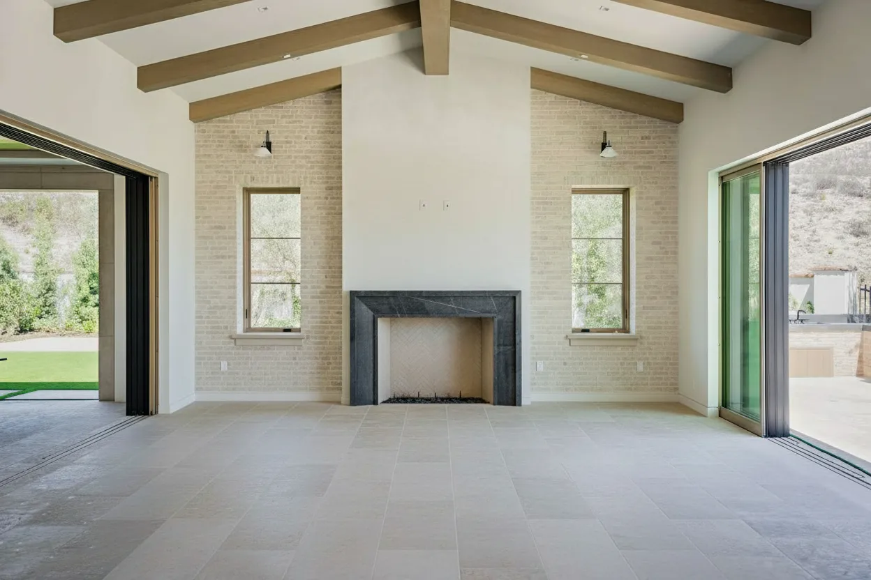
Create an Inviting Living Room
The living room is where buyers mentally move in. They picture themselves unwinding after a long day or hosting friends. Your job is to make that vision as inviting as possible. I’ve found that a mid-tone blue-grey with a soft, warm undertone is the sweet spot for living room walls.
Think of go-to shades like Benjamin Moore’s ‘Smoke’ or Sherwin-Williams’ ‘Uncertain Gray’. These colors have a sophisticated, calming effect without feeling cold or stark. They provide a stunning canvas that makes your staging furniture and decor pop.
For an instant touch of class, frame those walls with crisp, white trim. This timeless combination deepens the blue-grey and gives the entire room a clean, defined look. To balance the coolness of the blue, you have to bring in warmth through texture.
- A warm leather sofa or even a single armchair introduces a rich, organic feel.
- Cream or off-white linen curtains are perfect for softening the hard lines of windows.
- Brushed brass or gold accents on lamps, side tables, or even picture frames add that essential warm metallic glow.
Design a Modern and Timeless Kitchen
In the kitchen, blue-grey can deliver a high-end, custom look that feels both modern and timeless. It’s a fantastic way to stand out from the sea of all-white kitchens we’ve seen for the past decade. The most effective strategy? Using blue-grey on the cabinets.
A deeper, more saturated shade like Farrow & Ball’s ‘De Nimes’ or even the dramatic ‘Hague Blue’ works wonders on lower cabinets or a large central island. This technique grounds the space and creates a gorgeous contrast with lighter countertops and walls.
My personal favorite trick for an open-concept space is to paint only the kitchen island in a standout blue-grey. It defines the kitchen zone without overwhelming the larger living area and acts as a stunning focal point that buyers will remember.
Pair these bold cabinets with white or light-grey quartz countertops and a simple white subway tile backsplash. This keeps the overall look bright and airy, letting the blue-grey cabinetry be the undisputed star of the show.
Cultivate a Restful Bedroom Retreat
The primary bedroom needs to feel like a sanctuary. This is where buyers are looking for a calm, restful escape, and it’s where the lighter, airier blue-greys really shine.
I often recommend shades with a subtle green hint, like Sherwin-Williams’ ‘Watery’ or Benjamin Moore’s ‘Atmospheric’. These hues are known to promote a sense of peace and relaxation—a powerful emotional pull for anyone touring a home.
Painting all the walls in one of these soft colors can wrap the room in tranquility. To avoid a one-note look, layer in different tones of blue, grey, and white through bedding, rugs, and art. If you want more specific ideas, our guide on creating a beautiful bedroom with a blue accent and white walls is packed with inspiration.
Style a Spa-Like Bathroom Sanctuary
Blue-grey can instantly transform a bathroom into a luxurious, spa-like space. You can use it on the walls, but for a bigger impact, consider the vanity. A medium blue-grey vanity paired with marble-look tiles and either chrome or matte black fixtures is a surefire recipe for a high-end feel.
Don’t forget about architectural details. Adding wainscoting painted in a soft blue-grey with a crisp white wall above it creates dimension and character. To keep the proportions right, the wainscoting should typically cover the lower third of the wall—usually around 33-36 inches high in a room with a standard 8-foot ceiling. It’s a simple touch that makes a bathroom feel much more custom and thoughtfully designed.
Pairing Blue Grey with Complementary Finishes and Materials
A stunning blue-grey paint color is a great start, but it’s the supporting cast of finishes and textures that truly makes a room sing. A beautiful blue-grey wall can feel a bit one-note without the right material pairings. By layering in complementary elements, you build a space that feels rich, intentional, and thoughtfully designed.
Think of it as a balancing act. Blue-grey is inherently cool, so you need to bring in materials that either add warmth or create a striking counterpoint. This is where metal finishes, wood tones, and different fabrics become your most powerful design tools.
Create Warmth and Drama with Metallic Finishes
Metal accents are the jewelry of a room, and they are non-negotiable for a polished blue-grey interior. For an instant hit of warmth and understated luxury, my go-to is brushed brass or aged gold. The warm, yellow undertones play beautifully against the cool blue, creating a sophisticated look that feels both timeless and current.
You can weave this in through:
- A statement brushed brass faucet in a blue-grey kitchen.
- Gold-framed mirrors or art hung against a blue-grey accent wall.
- A living room featuring a brass floor lamp and side tables.
If your goal is a more modern, industrial, or even minimalist look, matte black is your best friend. It provides a bold, graphic contrast that makes everything feel sharp and contemporary. This works incredibly well for cabinet hardware, light fixtures, and window frames, making the blue-grey pop with crisp definition.

This conceptual flow shows how a core blue-grey aesthetic can be consistently applied across the main rooms of a home, anchored by foundational elements like a sofa, cabinets, or bed.
Incorporate the Natural Warmth of Wood Tones
Wood is absolutely essential for warming up a blue-grey space. I’ve found that the specific wood tone you choose can completely steer the room’s style. For a light, airy, Scandinavian vibe, try pairing your blue-grey walls with light oak or ash in the furniture and flooring. This combination keeps the space feeling bright and open.
On the other hand, if you’re aiming for a richer, more classic or mid-century modern look, bring in walnut or other dark-stained woods. The deep, warm tones of walnut create a stunning contrast against a mid-tone blue-grey, lending the room a real sense of depth and elegance. This approach is especially effective for larger pieces like media consoles, dining tables, or bed frames.
The key is to select materials that either complement the blue-grey’s coolness or provide a deliberate, warming contrast. Here’s a quick guide to help you visualize the effect of different pairings.
Blue Grey Material Pairing Guide
| Material Combination | Resulting Style | Best For |
|---|---|---|
| Blue Grey + Light Oak/Ash | Scandinavian, Coastal, Minimalist | Creating a bright, open, and airy atmosphere. Ideal for flooring, light-legged furniture, and open shelving. |
| Blue Grey + Walnut/Dark Wood | Mid-Century Modern, Traditional, Moody | Adding depth, sophistication, and a touch of formal elegance. Perfect for statement furniture and cabinetry. |
| Blue Grey + Brushed Brass/Gold | Modern Glam, Transitional, Art Deco | Infusing warmth and a sense of luxury. Excellent for faucets, lighting, mirrors, and decorative hardware. |
| Blue Grey + Matte Black | Industrial, Modern, Contemporary | Delivering sharp, graphic contrast and a clean-lined look. Great for window frames, fixtures, and hardware. |
| Blue Grey + Natural Textiles (Linen, Wool) | Farmhouse, Relaxed Contemporary, Bohemian | Softening the space and adding cozy, touchable texture. Best for curtains, bedding, rugs, and throw blankets. |
Choosing the right materials is about more than just looks; it’s about crafting a feeling. Each combination tells a different story within the same color palette.
Add Softness and Layers with Textiles
Finally, textiles are where you can inject softness, texture, and another layer of color. They’re what keep the design from feeling too hard or sterile. I always advise clients to think about materials that invite touch and add visual interest.
Some of my favorite textile pairings include:
- Velvet: A plush velvet sofa or accent pillows in a rich jewel tone like mustard, deep green, or even a contrasting navy can add immense luxury.
- Linen: For a more relaxed and casual feel, natural linen curtains or bedding provide a soft, textural quality that complements the inherent calm of blue-grey.
- Chunky Knits: A thick, wool-knit throw blanket draped over a chair or sofa adds an immediate cozy, welcoming feel—a must-have for cooler months.
These material choices aren’t just decorative afterthoughts; they are strategic decisions that build a cohesive and multi-layered design. If this kind of elegant layering appeals to you, you might also find some great ideas in our guide to achieving a classic French style decor. By thoughtfully combining these finishes, your blue-grey interior will feel balanced, warm, and completely captivating.
Selling Your Blue-Grey Property: Marketing with AI-Powered Staging
Getting the blue-grey paint on the walls is a major win, but the real work starts now. How you market that space is what will ultimately lead to a quick, top-dollar sale. It all comes down to photography, and this is where blue-grey can be a little tricky. You need to capture its sophisticated depth and character, not let it fall flat or look shadowy in photos.
While a professional photographer can certainly work wonders, the whole process of perfect lighting, physical staging, and potential reshoots eats up time and money. For real estate pros on a deadline, there’s a much smarter, faster way to get those stunning listing photos.
Your Shortcut to Picture-Perfect Listings
AI-powered real estate photography has completely changed the game, especially for homes with nuanced color palettes like blue-grey. Forget spending days and a small fortune on physical staging—now you can digitally transform a room in just a few clicks. Take a photo of a vacant, maybe even dated, room and instantly furnish it with modern pieces that make those new blue-grey walls sing.
With this kind of technology, you can:
- Virtually stage an empty room with designer furniture that elevates the blue-grey interior.
- Declutter and digitally remove any personal items, giving the space a clean, inviting feel.
- Create day-to-dusk images to show potential buyers how the home looks at golden hour, which is a huge emotional selling point.
For agents and designers, this is an incredible tool for efficiency. We’ve seen that virtually staged homes can sell faster and for more money. It’s all about helping buyers see themselves living there, and AI makes that visualization process practically effortless.
Real-World Scenarios for a Faster Sale
Let’s get practical. Imagine you just finished painting a living room in a beautiful, moody shade like Sherwin-Williams’ ‘Krypton’. The room is completely empty, and you need to get the property listed ASAP.
Instead of renting furniture, you can just upload a photo to an AI platform and select a style like “Coastal” or “Modern.” Instantly, the software can add a crisp linen sofa, a light oak coffee table, and some brushed brass accents—all perfect pairings for your new paint color.
This kind of immediate visualization is a lifesaver for online listings, where you have maybe three seconds to grab a buyer’s attention. You can even create multiple design options for the same room to show its versatility. If you’re a designer, showcasing these AI-generated visuals in a polished interior design portfolio template is a fantastic way to present your concepts to clients.
But it doesn’t stop at just adding furniture. You can use these tools to digitally brighten a north-facing room, swap a gray, overcast sky for a sunny blue one in your exterior shots, or even generate quick video tours for social media. For a complete rundown of what’s possible, our virtual staging guide for realtors has you covered.
Ultimately, AI helps you sell the dream of the blue-grey interior, creating an irresistible story that brings buyers right to the front door.
Common Questions About Blue Grey Interior Design
Even the most seasoned designers run into questions when exploring a new color scheme. When it comes to blue-grey, a few common concerns always seem to surface. Let’s walk through the most frequent ones I hear from clients and agents to help you move forward with confidence.
Think of this as your go-to cheat sheet for navigating those tricky blue-grey decisions.
What Colors Go Best with Blue Grey Walls?
The great thing about blue-grey is its incredible versatility. It’s a “neutral with personality,” so it plays well with a surprising number of colors. For a classic, can’t-miss combination, stick with brilliant white trim and ceilings. That crisp contrast just makes the blue-grey pop, giving the room a clean, architectural feel.
If you’re looking to add a bit more character, think about layering in some accent colors:
- Soft blush pinks and dusty rose are fantastic for creating a gentle, almost romantic vibe. Try them in pillows, throws, or even a subtle rug pattern.
- For a bolder statement, bring in earthy terracotta or a rich mustard yellow. An accent chair, a piece of art, or a vase in one of these warm tones provides a beautiful, grounding contrast.
- To go for a more dramatic, moody look, layer in deep navy or a dark forest green. This creates a sophisticated, monochromatic feel that screams luxury.
And don’t forget natural wood tones. They’re a perfect partner for blue-grey, adding organic warmth that grounds the entire space.
Does Blue Grey Make a Room Look Smaller or Colder?
This is probably the number one question I get, and it’s a fair one. The truth is, it all comes down to the specific shade you choose and the elements you pair with it. A lighter, airier blue-grey—one with a lot of white in its base—can absolutely make a room feel larger and more open, much like a classic off-white would.
Now, a darker, more saturated blue-grey can be incredibly effective for creating a cozy, intimate atmosphere in a larger room. But in a small room with limited natural light, that same color could feel a bit confining.
Here’s the secret weapon: texture. If you’re worried about a blue-grey feeling too cold, the antidote is always to introduce warm, tactile materials. A supple leather sofa, a chunky wool blanket, soft linen curtains, or brushed brass light fixtures will instantly balance the coolness of the paint and make the room feel inviting.
Is Blue Grey a Good Color for Selling a House?
Yes, one hundred percent. In the current market, blue-grey is a fantastic choice for boosting a home’s appeal. It strikes that perfect balance between being a safe, crowd-pleasing neutral and a color that has a distinct, stylish personality.
For today’s buyers, it feels more thoughtful and high-end than the standard-issue beiges or the stark, clinical greys that have been overused in recent years. When potential buyers walk into a home with a well-executed blue-grey palette, it sends a clear message: this property is modern, well-cared-for, and move-in ready. That’s a powerful selling point.
Ready to bring your blue-grey vision to life without the cost and hassle of physical staging? BrightShot uses powerful AI to instantly enhance your property photos. Add stunning virtual staging in over 80 design styles, declutter spaces, and create captivating visuals that sell faster. Try it for free at BrightShot.